FortyFive10° Brand Identity
Massimiliano Jacobacci, Managing Director at FortyFive10° approached me to
redesign his company’s identity.
FortyFive10° import, wholesale and retail some of Italy’s finest wines, often
exclusively within the UK. Their selection of wines can be found in some of the
top restaurants in London, including Annabel's, Cipriani, Harry's Bar, Sketch,
The Ivy and many more.
Identity design brief.
Massimiliano was not satisfied with the old FortyFive10° identity, shown below on their
business cards.

I asked what the new design should say about the company, and the following key words where
noted down:
great service, long lasting relationships, professional, classic, attractive, heritage, vintage,
the unique relationship between the grape and soil, craftsmen, from generation to generation,
expertise, passion, distinctive personality.
I was glad when Massimiliano added,
“The above key words should be called to mind, not shown explicitly.”
A clean attractive logo was called for, the final design had to work well in their stationary
(business cards) as well as for their new brochure website.
In black, inverted white, silver and in small sizes.
|
Research and Initial Sketches
A vital part of any design project, sketches allow for a free flow of ideas, unrestricted by computers.
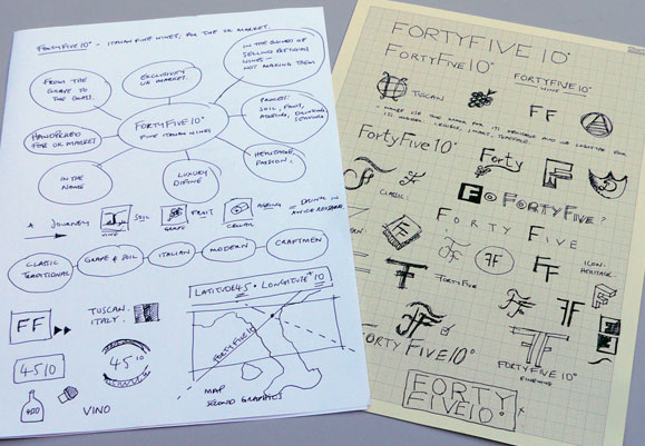
Various identity options
I had a quick look at the name "FortyFive10°" for ideas – which interestingly its Massimilianos
grandfathers vineyard latitude and longitute co-ordinates in Italy.
The identity needed to be Classic – an elegant, distinctive feel; but also Modern and dynamic,
reflecting a young company looking forward towards the future.
Modern and Classic in one?
Typography
Serif typefaces have a natural ability of looking smart and valuable when used properly,
rather than old fashioned.
(strokes have spiked / slab ends)
classic
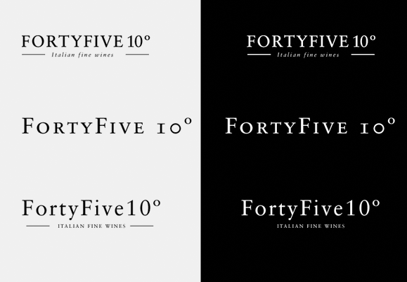
However, Sans serif has style in abundance, which is fresh and exiting.
(strokes have plain ends)
modern
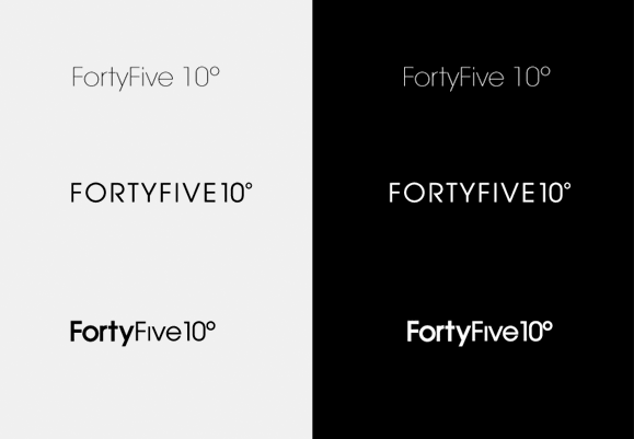
The exercise of seeing the name in both styles answers itself quickly.
Sans serif was easily preferred.
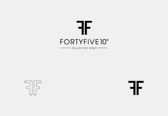
Massimilliano liked the idea of the double F sitting back to back very much like Kappa the italian
sportswear brand, although this option (below) was deemed too rigid.
Its interesting looking at what dosent work just as much at what does, its part of the design "journey".
But why does it not work? is it too square, too modern...? maybe just lacking a touch of flair to make
it more appropiate.
The final solution
The same layout as before but changing the F to an elegant scrip typeface brought
both worlds together.
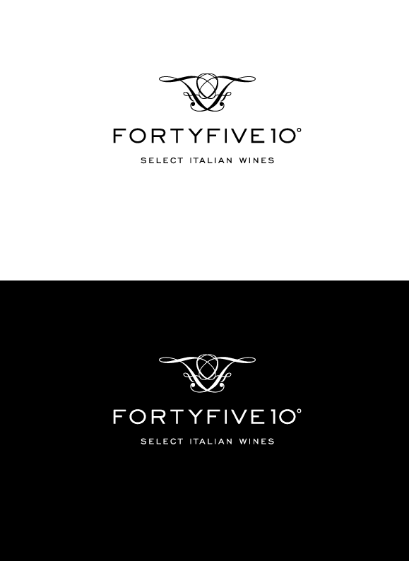
The double F icon has great organic qualities; like branches it reminded me of grape vines.
Whiles a finely cutomisised type face (Sackers Gothic Med. by Monotype) represents the
companies precision and profesionalism.
Notice how the 0 on 10 has been modified to echoe the O in FORTY.
These are the details that can set unique brands apart.
Black and reverse
It’s important to have an adaptable brand identity — so it may be used in any medium, wether its
printed, viewed on screen or even embroided.
Business card design
Once the identity was finalised, we began the business card design.
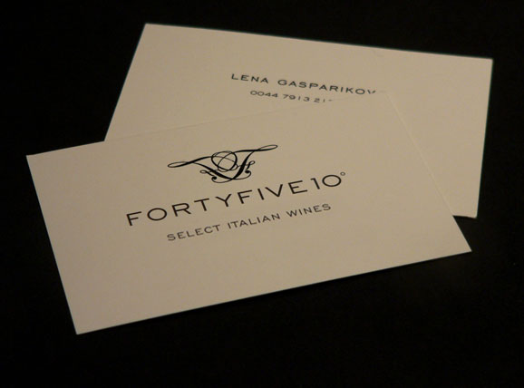
Below a photograph of the final business card printed on Uncoated natural white 400gms card.
The double FF has been embossed / raised slightly by thermography; adding an elegant touch to it.
Broucher website
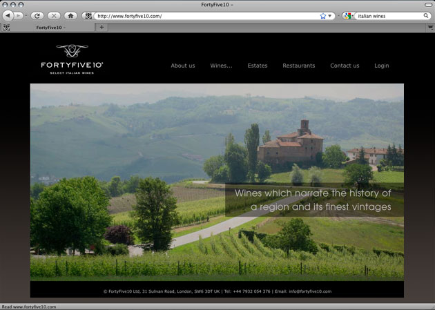
Also had the pleasure of designing their broucher website. With a fully content manage system –
which allows the client to update the copy and images easily by themselfs.
Please click on the image below to visit.
Client testimonial
We had been in quest of a graphic designer for several months but the few ones I got in touch with never
seemed able to meet our taste. Finally, when I discovered Dani through a Google search, it appeared likely
that such a passionate designer would be the partner we had been looking for — which became obvious as
soon as we started working together. After reviewing our requirements, Dani sent us a few proposals and,
taking great care, created numerous modifications.
The results surpassed our expectations – it is beautifully crafted, memorable and smart; but its much more
than that; its fun and has bags of charm!
Thanks Dani.
Massimiliano Jacobacci
Managing Director, FortyFive10°
